Main Line Commercial Painting: Color in the Workplace

- Can the choice of color have an effect on the productivity of employees?
- What about warm color being used as a tool to enhance the comfort level of employees?
- Can certain colors promote harmony stability and yes, even camaraderie?
- Which colors will promote clear fresh thinking, creativity and planning?
- Are there any colors that can be used in executive offices and boardrooms?
Productivity can mean different things to different people. If images of workers moving at a blazing speed across the shop floor is what you have in mind, a Main Line commercial painting project is not going to do that for any production facility, and it really shouldn't.
Creating a comfortable work space for employees by using color as a tool, is a more realistic expectation. The existing lighting situation, artificial or natural, is a strong consideration. Another factor is the current color of other elements such as carpets, window coverings or furniture. Taking into account the above as well as the proven influence of certain colors, a comfortable space can be created for employees. It is safe to assume that comfortable and happy employees will always be more productive.
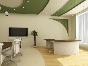
In "thinking" rooms such as classrooms and meeting rooms, very strong and contrasting tones may interfere with concentration. This does not necessarily mean that only boring and bland tones and colors will work in these rooms. Calm and cool colors can be used to promote clear thinking, creativity and planning. Such colors can be light sage greens, even clean beiges (not muddy). Clean, cool and light blues can also used thoughtfully to help the creative mind. Be sure to keep this in mind the function of the room or rooms you are painting when planning your Main Line commercial painting project, and choose colors that complement the activity.
In executive offices and boardrooms, strong colors such as burgundy, royal blue or brown can be used to state authority, promote respect and loyalty. There are circumstances where space, size of the rooms and lighting will not allow for the strong colors. The alternative is to use these colors on highlight walls, bulkheads, columns and sometimes doors, door frames and trim.
Sometimes the workplace is also where the customer is (for example retail or hospitality). In that case, the customers comfort level has to be balanced with that of the employees. Branding considerations, marketing decisions and how it affects the buying habits of the consumer should be of course taken into account when planning your Main Line commercial painting project. In reality, the comfort level and interests of the customer and company staff do not have to clash, especially in today's evolving marketplace.
In conclusion, the primary question always is: "what do you want color to do?"
After a clear understanding is evident and expectations are realistic, choosing a color scheme for your Main Line commercial painting project can be a rewarding experience that most employees can participate in. The ability to have a say and influence on the colors at work can be a powerful morale booster. And of course the jokes and light-hearted suggestions about the new pink, lilac or lime-green decor will last for days to come.
Latest Blogs
-
Cabinet Painting vs. Replacement: What Makes Sense for Your Kitchen?
Your kitchen works hard. When the doors get dinged, and finishes fade, you face a big decision: paint what you have or start from scratch. If your cabinet boxes are sturdy, cabinet painting can deliver a like-new look without the stress of a remodel. If your […]
-
When to Paint Indoors vs. Outdoors: Timing Tips Every Homeowner Should Know
At Mike Jasinski Painting, we know painting is more than just picking a color and grabbing a brush. Timing matters just as much as technique, especially when deciding whether your project belongs indoors or outside. As reputable Main Line painters, we’ve seen how the right (or […]
Our Most Recent Projects

Sophisticated Kitchen Update in Ardmore, PA
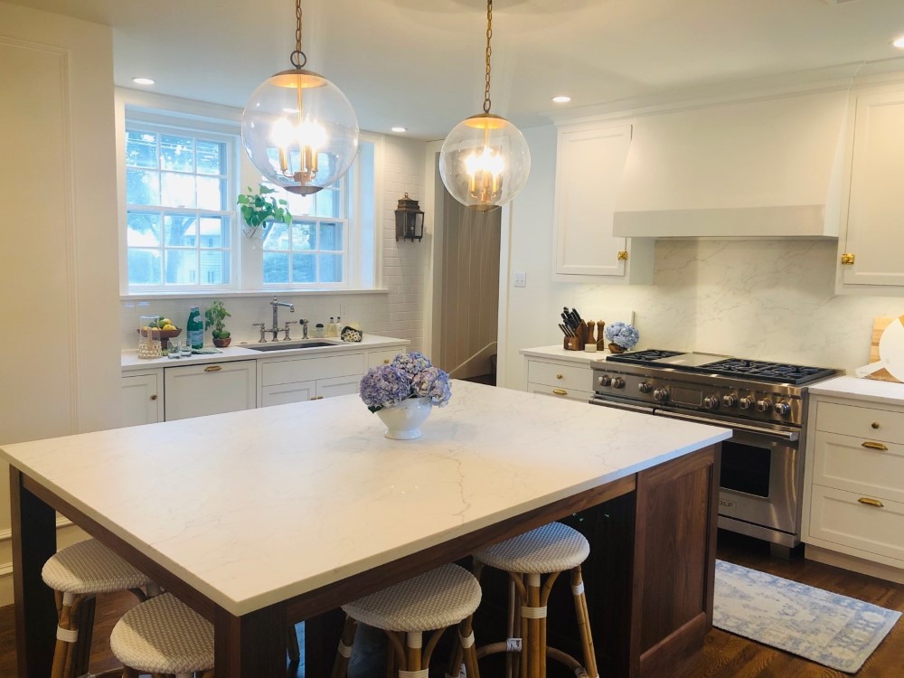
Memories are made in the kitchen, and while we cherish and remember the old, it's exciting to welcome new changes, as these Ardmore homeowners recently did. After Matt Isselman renovated the kitchen […]
See This Project
A Modern Take on an Older Kitchen in Villanova, PA
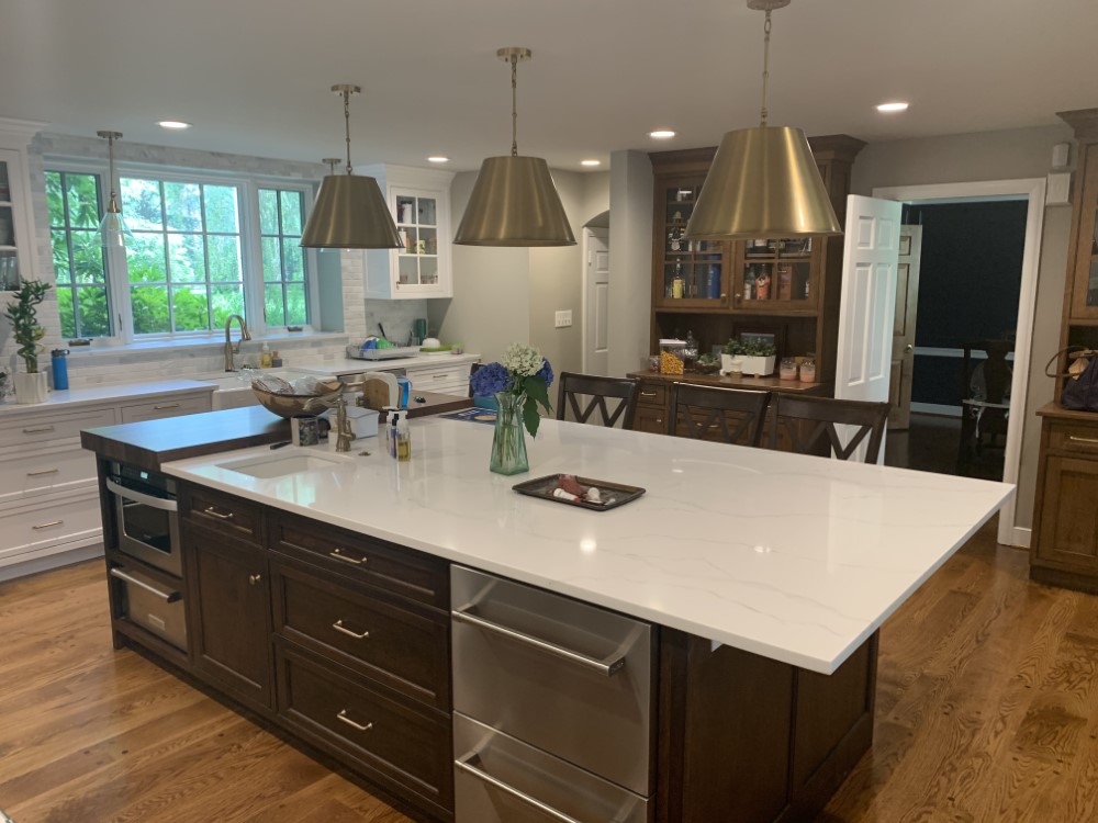
The kitchen is the heart of the home, and after these Villanova homeowners had Rob Gervasi and Son Construction give new life to their older kitchen with a modernized, open floor plan, we colored the […]
See This Project
Whole House Interior Painting in Gladwyne, PA
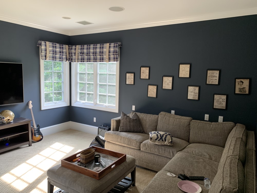
Mike Jasinski Painting completed an interior painting update for new home buyers in Gladwyne, PA, who were hoping to finish a large portion of their home transformation, specifically the bedrooms, be […]
See This Project