Color Your World: Issue No. 18
Color Your World Newsletter Keeps You Informed
Each month we share with you the latest news in home decor, seasonal colors, and tips on interior home painting. Please share our newsletter with all your friends.
GET A QUOTE: 484-554-6207
Fall Color Trends
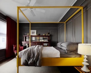
from Interior Design firm Homepolish
With the cooling weather, you're probably spending more time indoors, and you may realize the ol' home could use a facelift. Especially before your family and friends come over for the holidays. Well, paint is one of the most economical ways to make a dramatic shift to your space. Angela Belt of Homepolish, chatted with color expert Erika Woelfel to get the low down on what colors to infuse into the home this fall and how to use them to rejuvenate your space.
What is the best color combo for the fall?
"This fall, use gray as a statement color, and pair it with jewel tones and warm copper tones, especially during the holiday season. Steer away from silver finishes, and go for gold and brass metallics. Also, plan to use gray this fall as bold color versus a understated neutral."
What are some of the most common areas in the home to refresh with paint in the home?
"So dining, living, and guest rooms tend to be at the top of the list for a refresh this time of year. Changing the paint color in any one of these three areas can make a big difference."
How can you naturally lighten moody grays?
"Bring in some confident colors like green to balance out the gray tones. Green is also an on-trend chameleon color that can work well with both warm and cool tones to ground it. The most dominant color in the room could be a neutral gray, but layered with saturated colors. Play with the proportions of each color to make sure they work well together."
2017 COLOR OF THE YEAR
And it's Anything but Neutral
Even though in recent years whites, creams, and beiges have ruled the design world, color experts are taking a bold step away from this safe choice. Sure, last year their color for 2016 was Simply White OC-117, but this year they went with something they describe as a rich, deep amethyst: Shadow.
"After a year of looking at white, we were looking for something with more feeling," a color expert said at a reveal party at the New York Public library this week.
You might consider pairing this statement hue, with other jewel tones like ruby and emerald.
Here, the color is seen in a grand entryway and show homeowners you don't have to go light and airy with your entrance. Sometimes a dramatic, in-your-face hue does a better job setting a sophisticated tone to your home.
How to Make a Room Look Bigger Using Paint
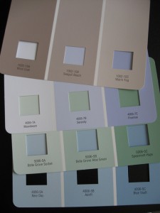
Small rooms in your home, apartment or other living space can present many design challenges, one of the most pressing which is figuring out how to lay furniture, accessories, and other elements out to maximize the use of space as much as possible — without also making the room seem cramped.
One of the ways that you can make a room appear larger is to carefully select paint colors to both highlight the existing space and match with the pieces and accessories you have already on-hand.
The following is a quick guide to how various paint color families will affect the perception of small rooms; as we will learn, sometimes a change in perception will do wonders for your home!
The overall guiding principle to use when selecting a paint color for a small room: cooler-toned colors will generally make a small room look larger, while warmer colors will make that same small room look smaller. The reason for this is because warm, bright colors, such as red and orange, tend to advance in your line of sight, while cool-toned shades of blue, purple and green tend to do the opposite — and you definitely use the latter to your small room's advantage. More neutral colors, such as whites, beiges, and pastel shades, can also do wonders to make a tiny room look more spacious! Again, be sure to use darker colors strategically so you don't end up making the room feel smaller.
Combining colors can be fun, but too many colors may make the room look more cramped. It's a good idea to limit your new color scheme to one or two colors for this reason. If you're not ready to paint all four walls with one shade of, say, a deep blue, try an accent wall to change things up a bit; if your other walls are painted in a neutral shade, an accent wall may "open up" the space and make it look larger than it is. Two opposite walls painted in the same color can considerably expand a sense of space.
Latest Blogs
-
How to Choose the Right Painter Without Relying on Search Results
When it's time to paint your home or business, most people hop online and type in something quick like "painters near me." But finding a quality painting company takes more than scrolling through local listings. You deserve a team that not only shows up on time […]
-
5 Benefits of Interior Painting During Winter
You might be surprised to learn that the colder months are some of the best times of year to have interior painting done inside your home if you live around the Main Line. Here’s 5 reasons why you should consider a Winter booking for your next […]
Our Most Recent Projects
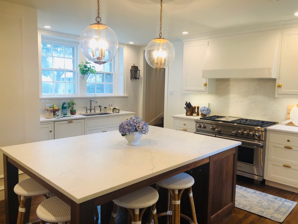
Sophisticated Kitchen Update in Ardmore, PA
Memories are made in the kitchen, and while we cherish and remember the old, it's exciting to welcome new changes, as these Ardmore homeowners recently did. After Matt Isselman renovated the kitchen […]
See This Project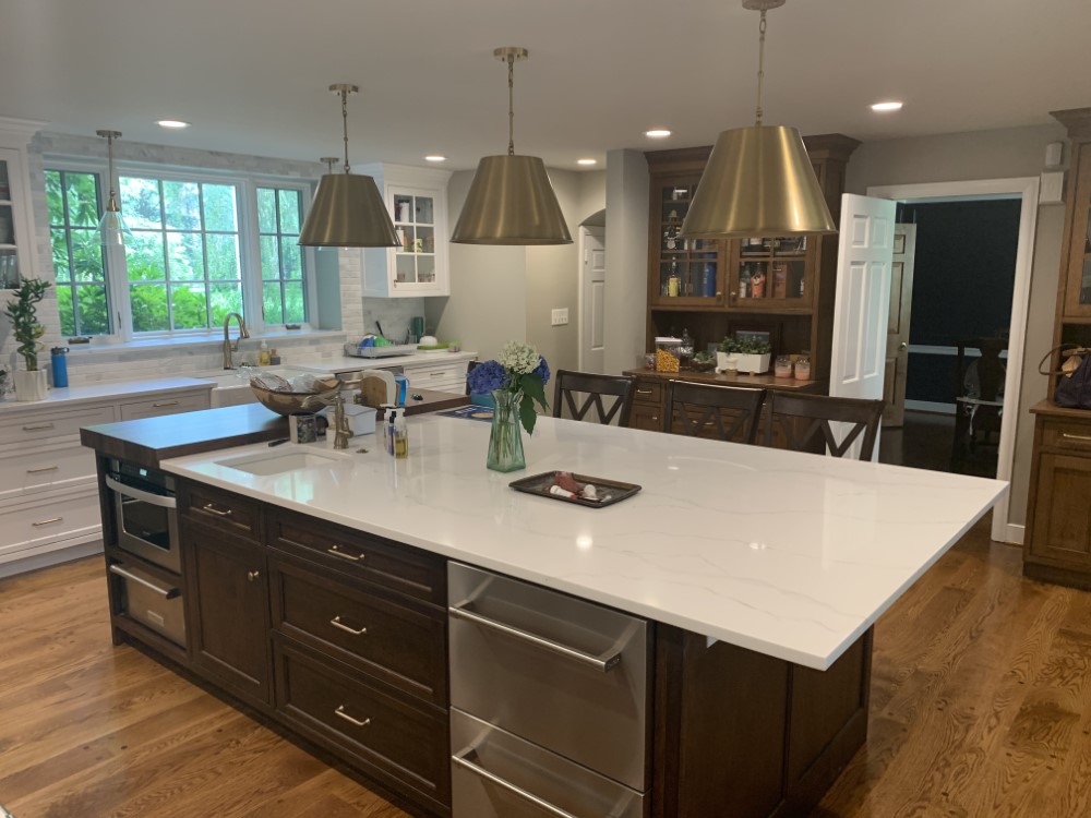
A Modern Take on an Older Kitchen in Villanova, PA
The kitchen is the heart of the home, and after these Villanova homeowners had Rob Gervasi and Son Construction give new life to their older kitchen with a modernized, open floor plan, we colored the […]
See This Project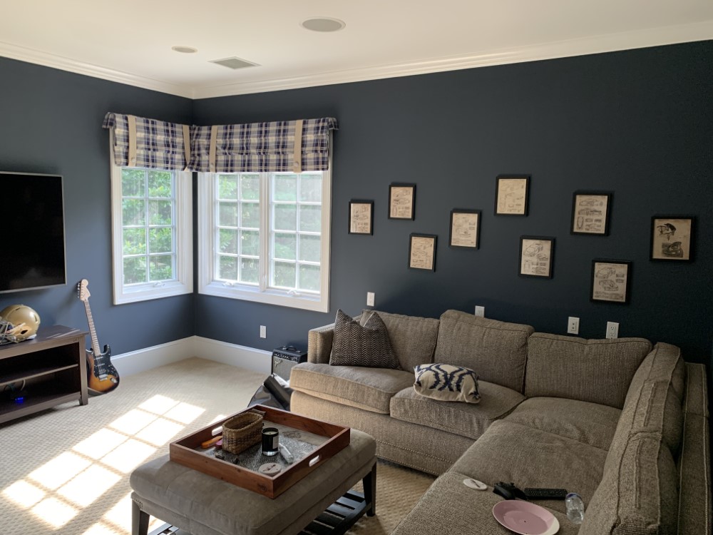
Whole House Interior Painting in Gladwyne, PA
Mike Jasinski Painting completed an interior painting update for new home buyers in Gladwyne, PA, who were hoping to finish a large portion of their home transformation, specifically the bedrooms, be […]
See This Project